Home


Menu

Close

Choosing Data Visualization Tools for Trustworthy AI and Ethical BI in 2026
Published:
August 25, 2026
In 2026, many businesses are using Artificial Intelligence (AI) to help them make smarter decisions. In fact, most large companies have at least one AI project running now, with global spending set to pass $300 billion this year alone [1]. But here's the thing: even with all this AI power, many companies are still struggling to get real value and trust from their AI systems. This is often because of a big problem we call the "AI bottleneck."
This bottleneck happens when AI models don't have enough ethical, human-approved data to learn from. Instead, they often use data found online, which can be twisted or changed. This leads to something called "Synthetic Drift," where the real meaning and truth about human behavior get lost as information spreads through digital systems. When data is not clear about where it came from (poor data provenance), the reports and insights from Business Intelligence (BI) tools can't be fully trusted. For example, while 71% of organizations use generative AI, only about 39% see a clear business impact [2]. This gap shows how important it is to have reliable data.
This is where data visualization tools become super important. They are key helpers for understanding what AI is telling us and for building back trust in AI-driven BI. These tools help us see complex data in simple pictures and charts. This makes it easier for people to understand the information and check if it makes sense. Good data intelligence, shown through clear visuals, helps us spot problems like Synthetic Drift and ensure that AI outputs are based on real, honest data.

It helps us overcome the challenge of why trust in business intelligence became the biggest bottleneck.
In this article, we will look at how to pick the right data visualization tools. We'll share clear ways to judge them, steps to manage how you use them ethically, and a plan to put them into action. Our goal is to help you build AI systems that are fair, reliable, and always put people first. You'll learn how these different AI tools can bring clarity and truth to your business data.
Now, let's look at the many data visualization tools that businesses use in 2026 to make sense of their information. It's like a big toolbox, with each tool designed for a different job. Knowing what these different AI tools can do is key to getting real value from your business data.
Types of Data Visualization Tools
When it comes to seeing your business data clearly, there are a few main types of tools.
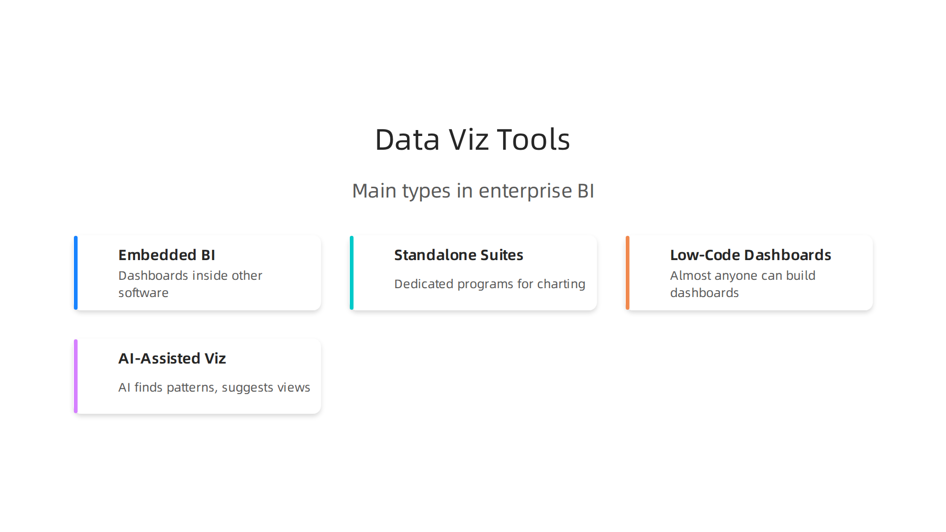
- Embedded BI Platforms: Think of these as data dashboards built right into other software you already use. They make it easy to see information without leaving your main work program. Tools like Tableau, Microsoft Power BI, and Looker can often be used this way, offering a seamless experience for users [1].
- Standalone Visualization Suites: These are dedicated programs made just for charting and showing data. They're like powerful art studios for your numbers. Popular choices for big companies include Tableau, Power BI, and Qlik Sense, which are great for detailed analysis and storytelling [2, 3].
- Low-Code/No-Code Dashboards: These tools let almost anyone build useful dashboards with very little or no computer coding. They're designed to be easy to use, helping more people in a company understand data quickly. Some tools even offer AI help in building these dashboards [4].
- AI-Assisted Visualization: These are the new kids on the block. They use AI to help you find important patterns and even suggest the best AI for statistics to show your data. ThoughtSpot, for example, is known for its AI-powered approach to business intelligence, making it easier to ask questions of your data and get visual answers [5].
Where Tools Live: Cloud vs. On-Premises
The way these data visualization tools are set up can really change how you control your data.
- Cloud-based tools store your data on big servers run by companies like Google, Amazon, or Microsoft. This means you can get to your data from anywhere, and it's easy to grow as your company grows. For instance, if you use a service like Firebase Analytics, your data is in the cloud. But you rely on the cloud company to keep your data safe and to show you where it came from (this is called data provenance).
- On-premises tools mean your data stays on your company's own computers. This gives you a lot more control over your data's privacy and security. It's great if your company has very strict rules about keeping data inside. However, you'll need your own team to manage and update everything, which can be harder as your data gets bigger.
Understanding these setups is part of building trustworthy AI in business intelligence and ensuring data is handled ethically.
How Tools Work Together in a Business
When choosing data visualization tools, companies also think about how well they can connect with other systems. This is called integration. There are always trade-offs:
- Flexibility: Some tools are very flexible, allowing you to connect to many different types of data sources and create unique reports. This gives you more freedom but can sometimes be more complex to set up.
- Scalability: This means how well the tool can handle more and more data or more users as your business grows. Cloud tools often do well here because they can easily add more power.
- Auditability: This is about being able to trace every piece of data back to its origin. It's super important for building trust and making sure your data intelligence is reliable. When data can be audited easily, it helps fight against "Synthetic Drift," where data gets changed or twisted over time.
Many companies try to find a balance, often using a mix of these different approaches to get the best out of their data visualization tools. It's all about making sure that the insights from their AI systems are clear, truthful, and helpful. You can learn more about how to evaluate AI tools with a framework for ethical data and trust.
| Tool Category | Best For | Key Feature | Examples |
|---|---|---|---|
| Embedded BI Platforms | Seamless reporting within existing apps | Built-in analytics, user-friendly | Tableau, Power BI, Looker [1] |
| Standalone Visualization | Deep dives, complex analysis | Advanced charting, detailed insights | Tableau, Power BI, Qlik Sense [2] |
| Low-Code/No-Code Dashboards | Quick dashboard creation by non-tech users | Drag-and-drop interfaces, minimal coding | Improvado [4] |
| AI-Assisted Visualization | Automated insights, guided data exploration | AI suggestions, natural language queries | ThoughtSpot [5] |
Even with the best tools, making sure your data insights are true and fair is a big job. It's not just about what the data visualization tools show, but also how they get there and if you can trust them. In 2026, building trust in AI and data intelligence is more important than ever.
Evaluating Tools for Trust, Ethics, and Data Integrity
When you pick data visualization tools, you need to check them against some key ideas to make sure they are giving you good, honest information.
These ideas help us avoid problems like "Synthetic Drift," where data can get changed or misunderstood over time.
- Provenance: This is like a birth certificate for your data. It means you can trace where every piece of data came from, how it was changed, and who touched it. Without good provenance, you can't really trust what the data is telling you. Provenance is a key part of creating trustworthy AI systems [1]. For example, a framework called Provena helps with tracking data lineage and tamper-evident logs for AI compliance [2]. You can also find frameworks specifically for government AI to establish data provenance [3].
- Explainability: Can the AI system or the data intelligence tool show you how it reached its conclusions? This is called explainability. If a tool just gives an answer without showing its work, it's hard to trust, even if it uses the best AI for statistics. Studies show that when AI systems can explain themselves, people trust them more [4]. Making AI understandable is important for building that trust [5].
- Differential Privacy Support: This is about protecting private information. Good data visualization tools should offer ways to show overall trends without revealing details about any single person. It's like seeing how many people like apples without knowing if you like apples.
- Access Controls: These are rules about who can see and use the data. Not everyone in a company needs to see all the data. Strong access controls make sure that only the right people can view sensitive information, keeping it safe. This is vital for security and privacy, as outlined by standards like NIST SP 800-162 for access control [6]. Visualizing access control policies can also help in managing who sees what [7].
- Tamper-Evidence: This means the data shows if it has been messed with. If someone tries to change the data or the way it's presented, a good system should leave a clear mark, proving that the data is no longer original. This is important for ensuring the integrity of your data.
How Visualization Choices Can Introduce or Hide Problems
The way data is shown can also lead to problems or hide them. When you make choices like:
- Aggregating data: This is when you group lots of small pieces of data into bigger chunks. If you group too much, you might miss important details or hide small but important changes.
- Smoothing lines: Sometimes, charts show smooth lines to make trends easier to see. But if the line is too smooth, it can hide real ups and downs, giving a false sense of how steady things are.
- Annotations: These are notes added to charts. While helpful, they can also be used to push a certain idea or distract from facts.
These choices can accidentally (or sometimes on purpose) introduce bias or "Synthetic Drift" into your data, making your business decisions less reliable. It's important for different AI tools to be transparent about these choices. To combat this, companies are using frameworks that define data quality for AI and machine learning systems, as seen in updates for 2026 [8].
Checklist for Verifying Outputs
To make sure your data visualization tools are giving you truthful insights, here's a simple checklist:
- Provenance Trails: Always check if you can follow the data's path back to its original source. Can you see who collected it, when, and what changes were made? This is crucial for auditing and trust [9].
- Reproducibility Tests: Can you or someone else get the exact same results by following the same steps with the same data? If not, there might be a problem with the tool or the process.
- Human-in-the-Loop Validation: Don't just trust the machines. Have real people look at the data and the visualizations. Do they make sense? Do they match what people know from their own experience? Human oversight is key for reliable data intelligence.
By using these steps, businesses can be more confident that their data visualization tools are helping them make smart, ethical choices, leading to more trustworthy AI systems overall. Knowing how to tell good data from bad is a very valuable skill in 2026.
Making sure your data is honest and fair is very important. Now, let's talk about how to bring these smart data tools, often powered by AI, into the everyday work of big companies. This is called integrating AI-powered visualization into enterprise BI workflows. It means helping businesses use the best data visualization tools to make smart decisions, every single day.
Technical Integration Patterns: Connecting the Dots
For big companies, simply having great data visualization tools isn't enough. They need to fit seamlessly into how data already moves around the business. Think of it like a train system for your data.
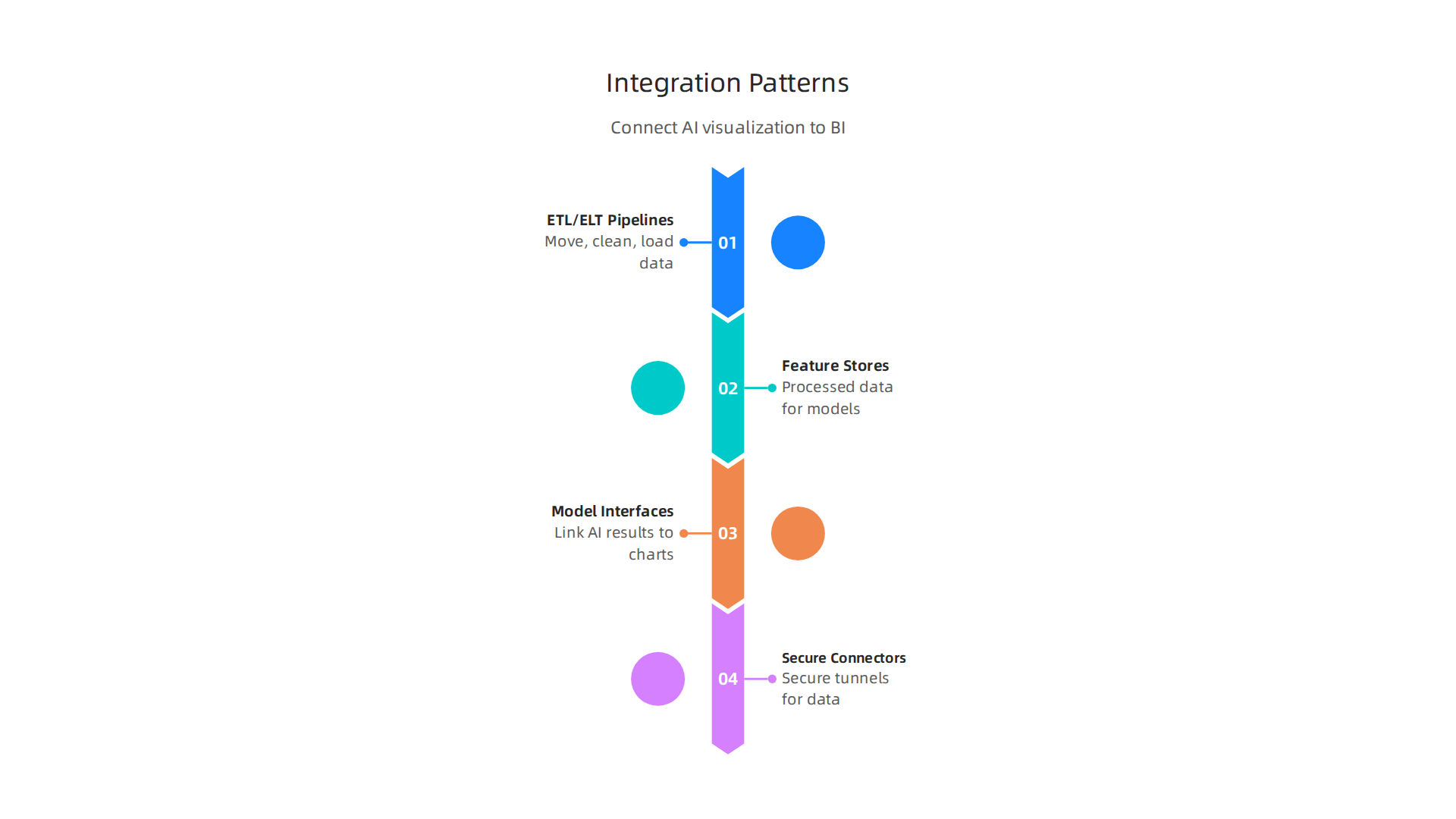
- ETL/ELT Pipelines: These are like the tracks and trains that move data from one place to another. ETL stands for Extract, Transform, Load, and ELT is Extract, Load, Transform. They get raw data, clean it up, and then put it where it needs to be, ready for analysis and visualization. These pipelines are key for feeding reliable information into different AI tools.
- Feature Stores: Imagine a pantry where all the ingredients for your AI recipes are pre-measured and ready. That's what feature stores do for AI. They hold processed data that AI models use to learn and make predictions. This makes it faster and easier to build new visualizations based on AI insights.
- Model-to-Visualization Interfaces: This is about how the smart answers from AI models actually show up on your screens. It's the link that turns complex AI results into easy-to-understand charts and graphs. For example, many of the best BI tools for data visualization in 2026 now have special features for AI dashboard and app building. Tools like Microsoft Power BI are known for combining strong visualization with enterprise features and value, making it a top choice for many companies in 2026. Other leading choices include Tableau and Looker for comprehensive business intelligence solutions Best 8 Data Visualization Tools Ranked (2026).
- Secure Connectors: These are like secret, safe tunnels that let your data visualization tools talk to different data sources without anyone else listening in. They keep your company's information safe while it's being used for data intelligence and creating visuals.
Operational Controls: Keeping Everything in Order
Even with great connections, you need rules and systems to keep things running smoothly and honestly.
- Versioned Datasets: This is like saving different drafts of a document. Every time data changes, you save a new version. This way, if something goes wrong, you can always go back to an older, trusted version. It helps in spotting "Synthetic Drift" by comparing current data against past records.
- Data Contracts: These are agreements between different teams about how data should be handled. They set clear rules for data quality, how it's defined, and how it should be used. This makes sure everyone is on the same page and helps to build trustworthy AI in business intelligence.
- CI/CD for Visualization Artifacts: This fancy name means that when you create new charts or dashboards, there's an automatic checking system in place. It makes sure new visuals follow the rules and work correctly before they go live. This helps avoid errors and keeps your data visualization tools working their best.
- Audit Logging: This is like a complete diary of everything that happens with your data. Every time someone accesses data, changes it, or creates a new visualization, it's recorded. This helps keep track of who did what and when, which is very important for security and trust.
Human-Centered Processes: The People Factor
Machines and AI are powerful, but people are still key. Good data visualization tools need people to guide them and make sure the insights truly make sense.
- Review Workflows: Before any important charts or reports are shared, smart people should look at them. These review workflows make sure that what the data shows matches up with what the experts know about the business. It’s an extra check to catch any mistakes or misleading visuals.
- Annotation Capture: Sometimes, a simple chart needs a little explanation. Annotation capture means you can add notes to your visuals. These notes can explain why certain choices were made, what assumptions were used, or what key takeaways there are. This adds context and makes the data easier to understand for everyone.
- Escalation Paths: What happens if a visualization shows something that just doesn't feel right to the experts? There needs to be a clear path to raise a flag. These "escalation paths" ensure that when visual outputs conflict with what people already know, it gets investigated quickly. This human oversight is crucial for ensuring that even the best AI for statistics isn't just trusted blindly.
By putting these technical steps, operational rules, and human checks in place, companies can make sure their AI-powered data visualization tools are truly helpful and reliable in 2026. This means getting real value from their data intelligence and building a strong foundation of trust.

By putting these technical steps, operational rules, and human checks in place, companies can make sure their AI-powered data visualization tools are truly helpful and reliable in 2026. This means getting real value from their data intelligence and building a strong foundation of trust. To truly make these tools reliable and fair, we also need to think about rules, good design, and clear roles for everyone involved. This helps make sure that the way we show data is always honest and helpful.
Governance, compliance, and human-centered design best practices
Making sure that smart data visualization tools work well and are fair is a big job. It's not just about the technology itself, but also about the rules we follow, how we design things for people, and who is in charge of what. This helps build trust in all the different AI tools a company uses.
Policy Layers: Setting the Rules for Data
Just like a game needs rules, data needs policies to keep everything in order. These rules tell us how to handle data at every step.
- Data Classification: This means labeling data based on how secret or important it is. For example, customer names and addresses are very sensitive, while general sales numbers might not be. Knowing this helps us decide who can see which data visualization outputs. It's like putting different locks on different doors.
- Access Policies: These policies decide who can look at, change, or use specific data. Not everyone in a company needs to see every piece of information. For AI systems, limiting access is very important to keep things safe and private. Rules like those from NIST SP 800-162 help guide how these controls are set up. Making sure only authorized people can use data for dashboards and reports is part of creating trustworthy data intelligence. There are even Access Control Policy Analysis and Visualization Tools to help companies understand these rules better.
- Consent and Permissions: This is about getting clear permission before using someone's data. Especially when dealing with personal information, asking for consent is key to being ethical. This ensures that any data used in your data visualization tools respects people's privacy.
- Retention: This policy simply states how long a company can keep certain data. You don't need to keep all data forever. Having clear rules helps manage storage and also reduces the risk if old data ever gets into the wrong hands. Good data governance frameworks, like those discussed in Data Governance Frameworks for AI Compliance for 2026, help define these time limits.
Design Principles: Making Sense for People
Even the smartest AI needs to show its findings in a way that people can easily understand. This is where human-centered design comes in for data visualization tools.
- Transparency: People should know how the data visualization was made. What data was used? What kind of AI helped create it? When you explain these things, people are more likely to trust what they see. Research shows that explainability contributes to trust in AI models.
- Legibility: This means charts and graphs should be clear and easy to read. Using simple colors, clear labels, and not too much information at once helps everyone get the message quickly.
- Contextual Nudges: Sometimes, a chart needs a little extra help. "Nudges" are small notes or hints added to a visualization to make sure people understand it correctly. They can point out important details or warn about things that might be misleading. This is vital to prevent misinformation, and there are even ways to evaluate misinformation warning interventions.
- Avoiding Attention-Optimizing Patterns: Some designs try to grab your attention more than they try to be helpful or honest. Good human-centered design makes sure that data visualization tools don't try to trick people into looking at certain things, but instead help them understand the real story the data tells. This supports human flourishing by ensuring data intelligence promotes true understanding.
Roles and Responsibilities: Who Does What
For all these policies and designs to work, everyone needs to know their part.
- Mapping Stakeholders: This means figuring out who needs to be involved. This can include:
- Chief Data & AI Officer (CDAO): The main person in charge of all data and AI efforts.
- Ethics Leads: People who make sure the AI and data are used in a fair and moral way.
- Security Teams: Experts who protect the data from being stolen or misused.
- User Experience (UX) Designers: People who make sure the data visualization tools are easy and pleasant for users.
- Establishing Sign-off and Review Rhythms: It's important to have regular check-ins. Before any big data visualization goes live, key people should review it. This helps catch mistakes, ensure compliance with rules, and confirm that the visuals are clear and honest. This consistent review is a core part of a trust first AI strategy becomes business imperative in 2026. It also helps companies to evaluate AI tools with a framework for ethical data and trust.
By carefully setting up these policies, designing with people in mind, and making roles clear, companies can ensure their AI-powered data visualization tools are not just smart, but also responsible, fair, and truly trustworthy in 2026. This strengthens overall data intelligence.
Finding the right AI-powered data visualization tools is a big step for any company in 2026. It's not just about picking the flashiest software. It's about choosing tools that you can truly trust, especially when making important business decisions. This means we need a clear way to select these tools for business intelligence (BI) that puts trust first.
Actually, many businesses are using AI more than ever. Reports from 2026 show that a lot of companies, around 71%, are using some form of AI. Also, about 72% of bigger companies already have AI programs running. This high use means it's super important to choose the right data visualization tools that you can rely on to give you honest and clear data.
Practical framework to select data visualization tools for trust-first BI
To pick the best data visualization tools, follow these steps. They help you find tools that are not only powerful but also trustworthy for your business intelligence needs.
Step-by-Step Selection Framework
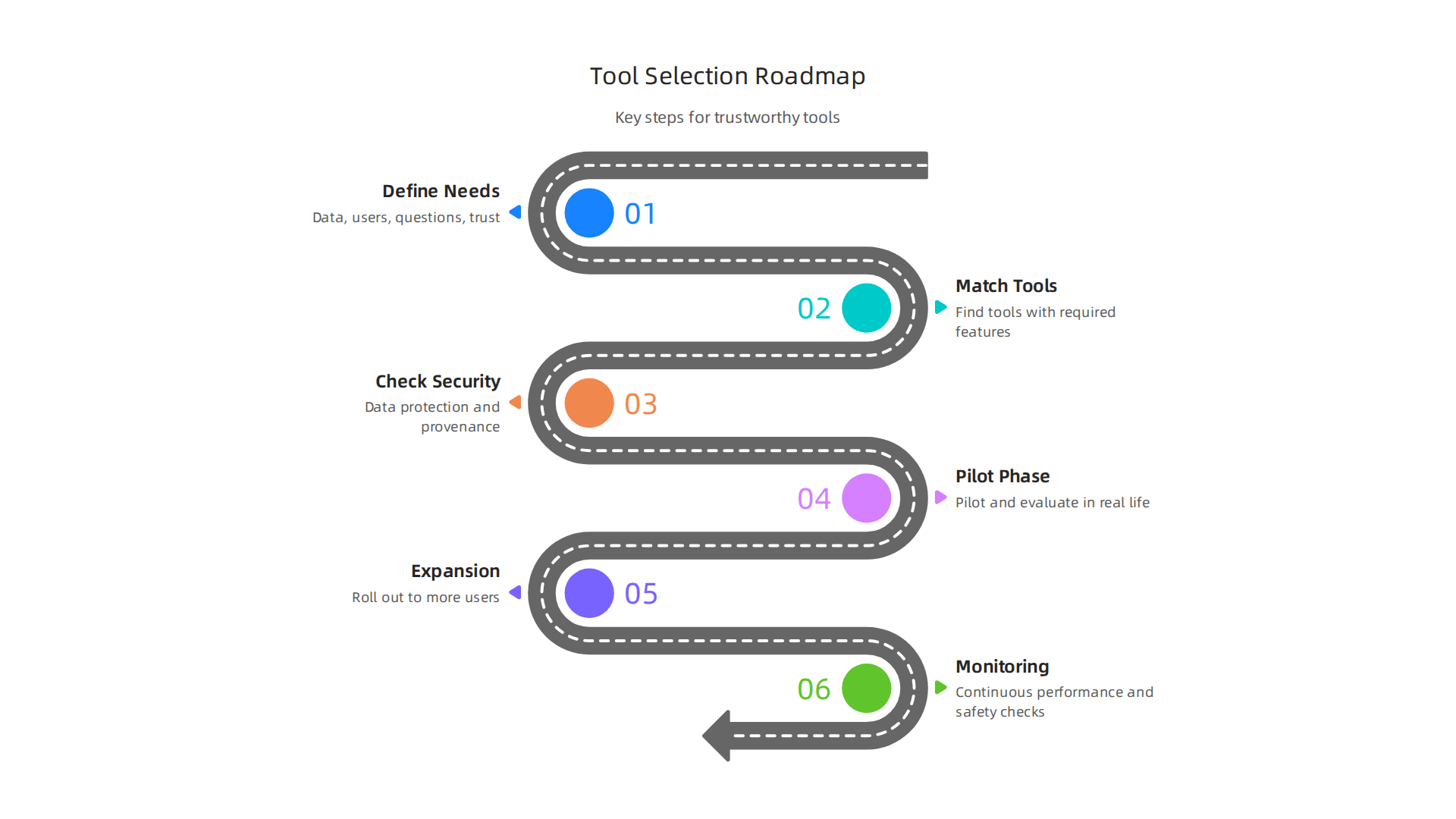
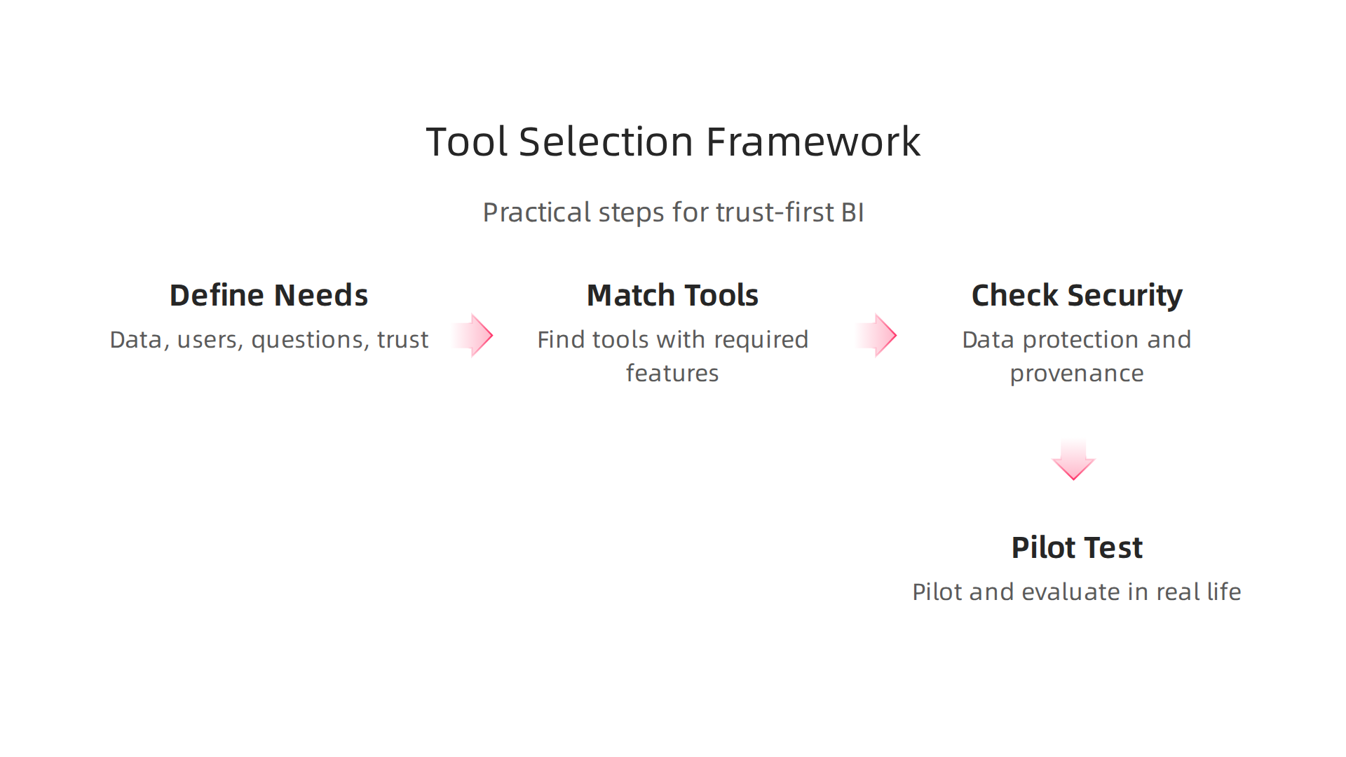
- Define Your Needs: First, figure out exactly what you need the data visualization tools to do.
- What kinds of data will you be looking at?
- Who will be using these tools?
- What questions do you need answers to?
- Think about how important trust is. Do you need to see exactly where every piece of data came from, or how the AI made its decisions? For true business intelligence, this kind of detail is key.
- Match Tools to Your Needs: Look at different AI tools on the market. Do they have the features you listed? Some tools are better for certain types of data or for making certain kinds of charts. You'll want to find those that support strong data intelligence.
- Check Security and Provenance: This step is super important for building trust.
- Security: How well does the tool protect your data from bad actors? Good security keeps your information safe.
- Provenance: Can the tool show you where all the data came from? This means tracking data from its start, through any changes, and into the final chart. Knowing the data's story helps you trust the picture it paints. It's like checking the ingredients and recipe for a meal. A good framework for tracking data origins can help government AI systems, and the same ideas apply to businesses. There are even models that help explain the journey of data in dashboards, which is called dashboard provenance. This also includes making sure the data quality is good. New rules like the Data Quality Visualization Framework for AI and ML: May 2026 help with this.
- Try It Out (Pilot & Evaluate): Before buying a tool for your whole company, test it with a small group. See how it works in real life. Does it meet your needs? Is it easy to use? Does it produce trustworthy results? This pilot phase is vital to make sure the data visualization tools really help your business.
Scoring Rubric: What to Look For
When you are testing data visualization tools, use a simple scoring system. Give points for how well each tool does in these areas:
- Data Governance: How well does the tool follow your company's rules for managing data? This includes who can see what and how data is kept safe.
- Privacy: Does the tool protect sensitive information? This means it should keep private data, well, private.
- Explainability: Can the tool easily show how it got its answers? If an AI helps create a chart, you should be able to understand the steps it took. This helps people trust the data.
- Integration: How easily does the tool work with other programs your company uses? It should fit smoothly into your existing setup.
- User Experience (UX) for Experts: Is the tool easy for your data experts to use? Good design means less frustration and better work.
- Maintenance: How much effort does it take to keep the tool running smoothly? Lower maintenance means fewer headaches later on.
By scoring tools on these points, you get a clear picture of which ones are the best fit for your trust-first business intelligence approach. This will help you evaluate AI tools with a framework for ethical data and trust.
Vendor and Open-Source Trade-offs
When choosing data visualization tools, you usually have two main choices: buying a tool from a company (vendor) or using an open-source tool that's free to use and change. Both have good points and bad points.
- Vendor Tools: These often come with good customer support and are usually easier to set up. But they can be costly, and you might not have full control over how they work or how your data is processed. However, many companies rely on them for their BI roadmaps, as shown in the Dresner Advisory Publishes 17th Edition Flagship Business Intelligence Market Study.
- Open-Source Tools: These are usually free and let you change them to fit your exact needs (this is called extensibility). Because many people can look at the code, these tools often get a lot of community scrutiny, which can help find and fix problems faster. You also have more control over your data. But, you might not get dedicated customer support, and you need people on your team who know how to set them up and fix them.
Choosing between these different AI tools depends on your budget, your team's skills, and how much control you want over your data and the tool itself. Remember, building trust in business intelligence has become a major challenge for many organizations, and picking the right tool can help overcome this why trust in business intelligence became the biggest bottleneck.
After you pick the right data visualization tools, the next big step is putting them to work. This means having a clear plan for how to introduce them into your business. A careful rollout helps make sure these tools are trusted and used well.
Implementation Roadmap, Pilots, and Risk Mitigation
Bringing new data visualization tools into your company should happen in steps. This helps you check that everything works correctly and builds trust along the way.
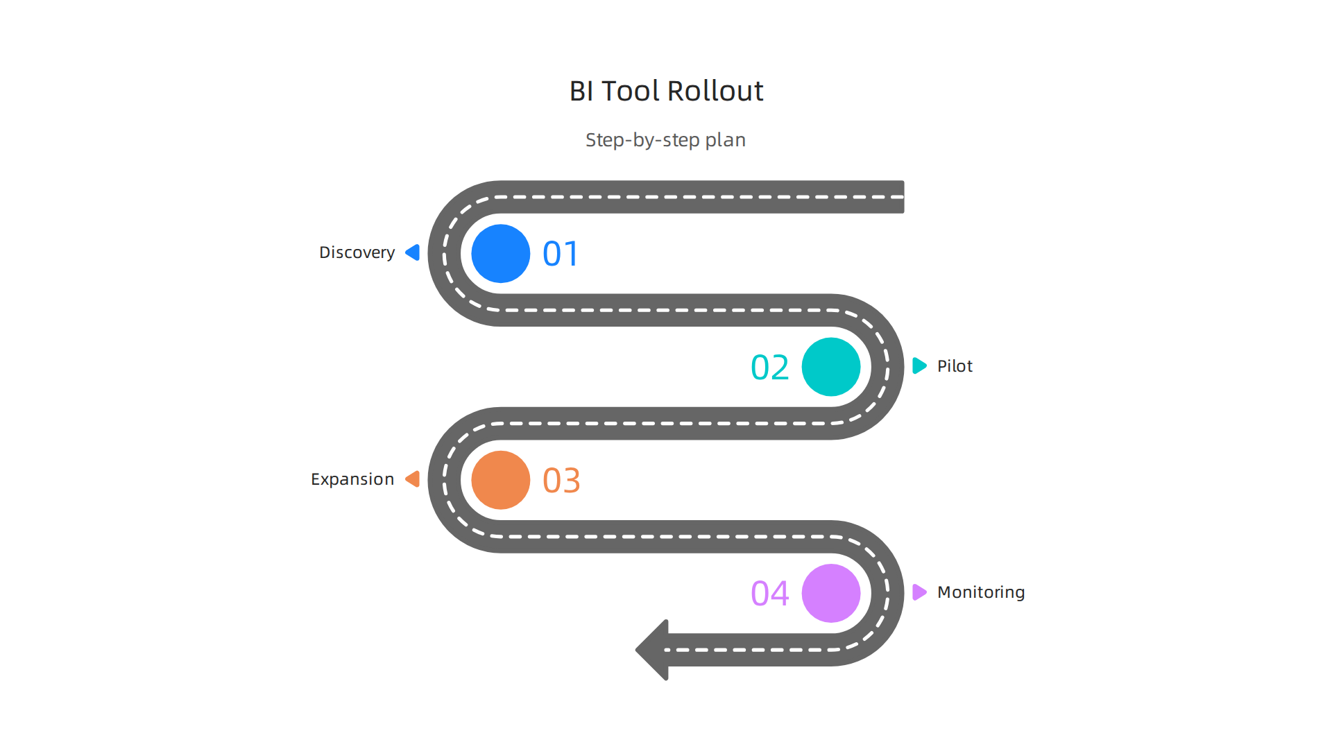
Think of it as a journey with different stops.
Step-by-Step Rollout Plan
- Discovery Phase: Even after picking a tool, you still need to learn more. Ask your teams what they expect. What kinds of reports do they need daily? What specific problems do they want the new data visualization tools to solve? This helps fine-tune your plan.
- Pilot Phase: This is like a small test run. Pick a small team or a specific project to try out the new tools. This phase is super important because it lets you see how the tools work in real life without big risks. Many AI projects start with pilots, and having a good plan helps avoid common problems. For instance, sometimes AI pilots don't lead to full company use because they weren't planned well at the start. An AI Implementation Roadmap: Why Most Pilots Fail in 2026 can help you succeed.
- Expansion Phase: If the pilot goes well, it's time to let more people use the tools. You might roll them out to one department at a time, or add more features as people get comfortable.
- Continuous Monitoring: Even after everyone is using the tools, you need to keep an eye on them. This means checking that they are still working right, keeping data safe, and providing useful, trustworthy information.
Key Things to Measure During Pilots
When you're doing a pilot program, you need to know if the data visualization tools are truly trustworthy. Here are some key things to check:
- Provenance Coverage: Can the tool show exactly where all the data came from? The more it can track data history, the better.
- False-Signal Detection Rate: How often does the tool show something that is wrong or misleading? You want this number to be very low.
- User Confidence Scores: Ask the people using the tool if they trust the information it gives them. High confidence means they believe the data intelligence.
- Audit Readiness: Can you easily check how the tool made its charts and decisions? This is important for proving that the data is correct if someone asks.
Handling Risks with Care
Even the best data visualization tools can have problems. It's smart to plan for these risks.
- Model/Data Drift Monitoring: Sometimes, the way an AI tool understands data can slowly change, or the incoming data itself might change. This is called "drift," and it can make the tool less accurate over time. You need to watch for this and fix it fast. Understanding how to tackle these issues can help in overcoming synthetic drift building trustworthy AI.
- Reversible Changes: Make sure you can undo any big changes made by the different AI tools. If a new report or a way of showing data doesn't work, you should be able to go back to how things were before without a lot of trouble.
- Human Override Channels: People should always have the final say. If the AI makes a mistake or gives a weird answer, there needs to be a way for a person to step in, check it, and correct it. This human oversight is key for maintaining trust in your data intelligence.
Summary
This article explains why trustworthy data visualization is essential for getting real value from AI-powered business intelligence in 2026. It defines the AI bottleneck and Synthetic Drift, then shows how clear visuals, provenance, and human oversight restore confidence in AI outputs. You'll get a practical breakdown of the main tool categories (embedded BI, standalone suites, low/no-code, AI-assisted), the trade-offs between cloud and on‑premises deployments, and the integration patterns (ETL/ELT, feature stores, secure connectors) used in enterprises. The piece gives concrete evaluation criteria—provenance, explainability, differential privacy, access control and tamper‑evidence—plus a checklist and scoring rubric for pilots. Finally, it covers governance, roles, design principles, and a stepwise rollout plan so teams can select, test, and scale visualization tools that keep data honest, auditable, and useful for decision‑making.
Related Blogs
No Similar Blogs found
